Guide · · By the CHSALL team
Cheer uniform lettering and logo placement: what works on the mat
Where the team name, numbers and logo should sit on a cheer uniform, how size and contrast affect legibility on the mat, and what artwork to send your supplier.
Key takeaways
- Placement is a legibility decision, not a taste decision: distance and sightlines decide what the audience actually reads.
- The back carries the team name and number; the chest or sleeve carries the logo where it is seen up close.
- Fine logo detail disappears at competition distance. Simplify the mark for the back rather than enlarging a detailed version.
- Send vector artwork and the exact spelling of every name. Raster files and screenshots usually have to be redrawn.
Two teams can order the same garment shape in the same colours and look completely different, because of one thing: where the lettering, numbers and logo sit. Placement decides whether your team name is readable from the stands, whether the number is clear during a formation, and whether your logo survives being printed, stoned or embroidered. This guide covers the standard zones, the size rules that matter, and what to send your supplier before production starts.
Why placement matters more than the artwork
A uniform is read at two very different distances. At competition distance, judges and the audience see a moving silhouette, so only large, high-contrast elements register: the team name across the back, a number, a strong block of colour. At close range, during team photos and warm-ups, the logo, trim and small details are what people notice.
That is why the same logo cannot do both jobs. A mark with thin strokes and small text works at close range and turns to mush at distance. If the logo has to appear on the back, use a simplified version, and keep the detailed one for the chest or sleeve.
The standard zones
| Zone | Usually carries | Why |
|---|---|---|
| Chest / front | Logo or small team mark | Seen up close and in photos; keeps fine detail viable |
| Back | Team name, number or both | The side the audience reads during a routine; largest available flat area |
| Sleeve | Logo, school mark, sponsor | Good for a second identity element without crowding the chest |
| Skirt or short leg | Team name, mascot, side stripe | Adds identity when the top is already busy |
| Warm-up jacket | Surname, team name on the back | Worn before and after performance, and on travel days |
Team name and lettering
- Case: all caps reads best from a distance, but it needs slightly more spacing so the letters do not merge. Mixed case is easier to read up close and suits a smaller chest placement.
- Tracking (letter spacing): a common mistake is setting the team name tight to fit a fixed width. If the name is long, shorten it or reduce the height rather than squeezing the letters together.
- Height: back lettering is read from across a hall, so it should be large enough to stay legible with a body in motion. Judge this on a mock-up photo of an athlete's back, not on a flat artwork file.
- Curve or straight: a straight line is easier to read; an arched line follows the shoulder shape and suits shorter names.
Numbers
Numbers cause most of the legibility complaints, because several digits look alike at speed:
- Avoid 1 next to 7, and be careful with 6 and 8, 0 and the letter O, and 3 and 8 in thin fonts.
- Choose a font with an open counter and a distinct 1 with a base serif, rather than a condensed font where the digits close in.
- Judge size on the garment, not on screen. A number that looks generous in a flat file can shrink once the panel curves around the body.
- Repeat the number consistently across front and back if you use both, so it reads as the same identity.
Logo placement and minimum size
- Chest left is the conventional position for a single logo; it sits above the heart side and stays visible with the arms down.
- Centred chest works when the logo is the main design element, but it competes with a centre zipper or a keyhole detail.
- Minimum size: any text inside the logo has to stay readable at the finished size. If the smallest letter becomes a smudge, drop the text and keep the mark.
- Against a busy print, give the logo a solid or outline holding shape so it does not sit directly on a pattern.
Contrast and the mat
Contrast decides legibility more than colour preference does. Lettering in a mid-tone colour on a mid-tone background may look fine on a screen and disappear under competition lighting. The safest combinations are the extremes: very light lettering on a dark garment, or the reverse. If your team colours are close in value, separate the lettering with a contrast outline or a solid panel behind it. Our guide to choosing cheer team colours covers contrast rules, school colours and white uniforms in more detail.
Decoration method changes the rules
| Method | Placement implication |
|---|---|
| Sublimation print | Any position, including across seams; fine detail and gradients are possible; best for large, colourful back designs |
| Rhinestones / stones | Sits on top of the fabric, so avoid crossing high-stretch areas; a stoned logo needs a simplified outline to stay clean |
| Embroidery | Works best on a flat, stable area; very small text can close up, so reduce letter count or size up the patch |
| Applique / patches | Adds weight: not ideal on a light, high-stretch panel, and position it away from the points that take the most strain |
If you have decided between printed and stoned decoration only after approving placement, placement usually has to change. Our comparison of sublimation vs rhinestones explains where each method is strongest before you commit to a position.
What to send your supplier
- A vector logo file (AI, EPS, PDF or SVG). A screenshot, a low-resolution PNG or a photo of last season's shirt usually has to be redrawn.
- The exact spelling of the team name, and of every athlete name if names go on the garment. Send it as text, not as a picture of text.
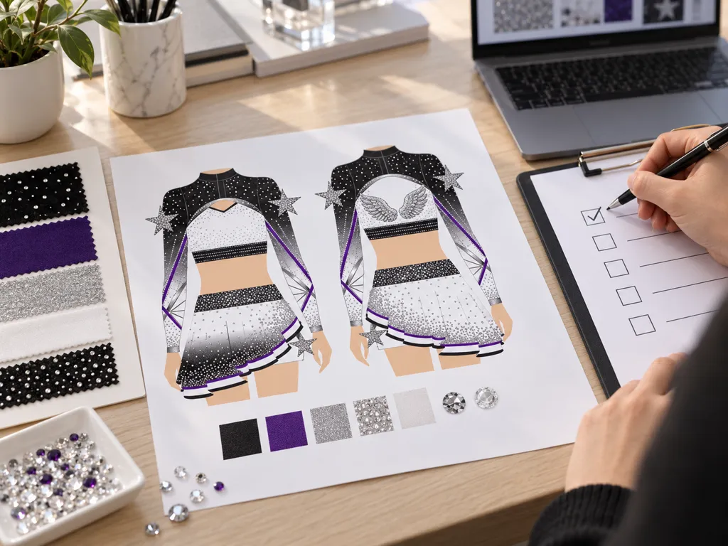
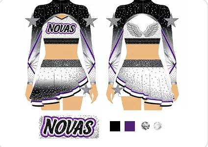
- A placement diagram (front and back) showing which element goes where, with a rough size relative to the garment.
- A photo of last season's uniform if you are continuing a look, plus notes on what you want to change.
- Any league or school restrictions on lettering, numbers or sponsor marks. Check these before artwork is finalised rather than after.
Common mistakes
- Approving lettering from a flat file without seeing it on a mock-up of an athlete's back.
- Scaling a detailed logo up to fill the back instead of simplifying it.
- Using low-contrast team colours for lettering and hoping the outline will save it.
- Changing boys' and girls' cut but keeping one placement for both, so the chest logo sits differently on each.
- Sending a name list as a screenshot, then spending a week correcting spelling at layout stage.
Want to see placement examples before you decide? Browse our design concepts for front and back views of finished uniforms. Practice sets follow the same placement logic on a smaller scale — see our cheer practice wear. Ordering for several teams, a gym or your own label? See wholesale and OEM.
FAQ
Where does the team name go on a cheer uniform?
Across the back is the standard position, because that is the side the audience and the judges see during a routine. A smaller chest placement on the front is common on practice wear and warm-ups. Check your own league or school rules before you finalise placement.
Should the logo go on the front or the back?
In most cases the logo reads better on the chest or sleeve, where it is seen up close, while the team name and number take the back. A detailed logo placed on the back at competition distance loses its fine detail, so use a simplified version if you want it there.
What artwork file should I send for uniform lettering?
Send a vector file (AI, EPS, PDF or SVG) of the logo, plus the exact spelling of the team name and every athlete name, and a simple diagram or sample photo showing where each element should sit. Raster files such as a screenshot or a photo of a shirt usually cannot be reproduced cleanly without redrawing.
Planning team uniforms?
Send your style, colors, quantity and deadline: we reply with a quote. General MOQ 10 pcs, production 10–25 days.